Web app • Product design • Branding • 2020
Vilmari peer-to-peer car rental

Role
Product designer
Team
Startup team and developers
Timeline
2020
Status
Designed and tested with customers
A peer-to-peer car rental platform where people rent a car from someone nearby, or list their own to earn money, with no hidden fees.
The problem
Cities are trying to make getting around easier with electric scooters and shared bikes. They help, but they also add more vehicles to already crowded streets.
Meanwhile, plenty of private cars sit parked most of the day. Renting one from a big rental company often means long policies, extra fees and surprises at the counter.
The goal was a peer-to-peer platform where people could rent a car from someone nearby, or list their own to earn money, in a way that felt safe, simple and transparent.

My role
I was the product designer at Vilmari Technologies. I did the competitive analysis and user research, created the brand, designed the web app and built prototypes that we tested with real customers.
Starting with people
I started by looking at who would actually use a service like this. Three groups stood out:
Younger drivers who don't know the big rental brands and don't want to read long policies to rent a car.
Car owners looking for a simple way to earn extra money from something they already own.
People living more sustainably who would rather share than buy things they don't need.
What they had in common was trust. Renting a car from a stranger, or handing your car to one, only works if both sides feel safe.

Bringing stakeholders in
We met weekly as a team and reviewed every idea internally before it went further. I talked through each feature with the developers early, so we knew what was realistic to build before committing to it.
Those check-ins kept the scope small and focused on what mattered most for a first version: trust, listing a car and finding one nearby.
Prototyping early
We prototyped quickly and showed ideas to people as often as we could, both in person and remotely. Testing with real customers let us change direction fast.
With a basic navigation structure and the first brand elements in place, I explored different homepage concepts and tested which ones felt most trustworthy. I also watched how people used the search at the top of the page, since that's where every rental starts.
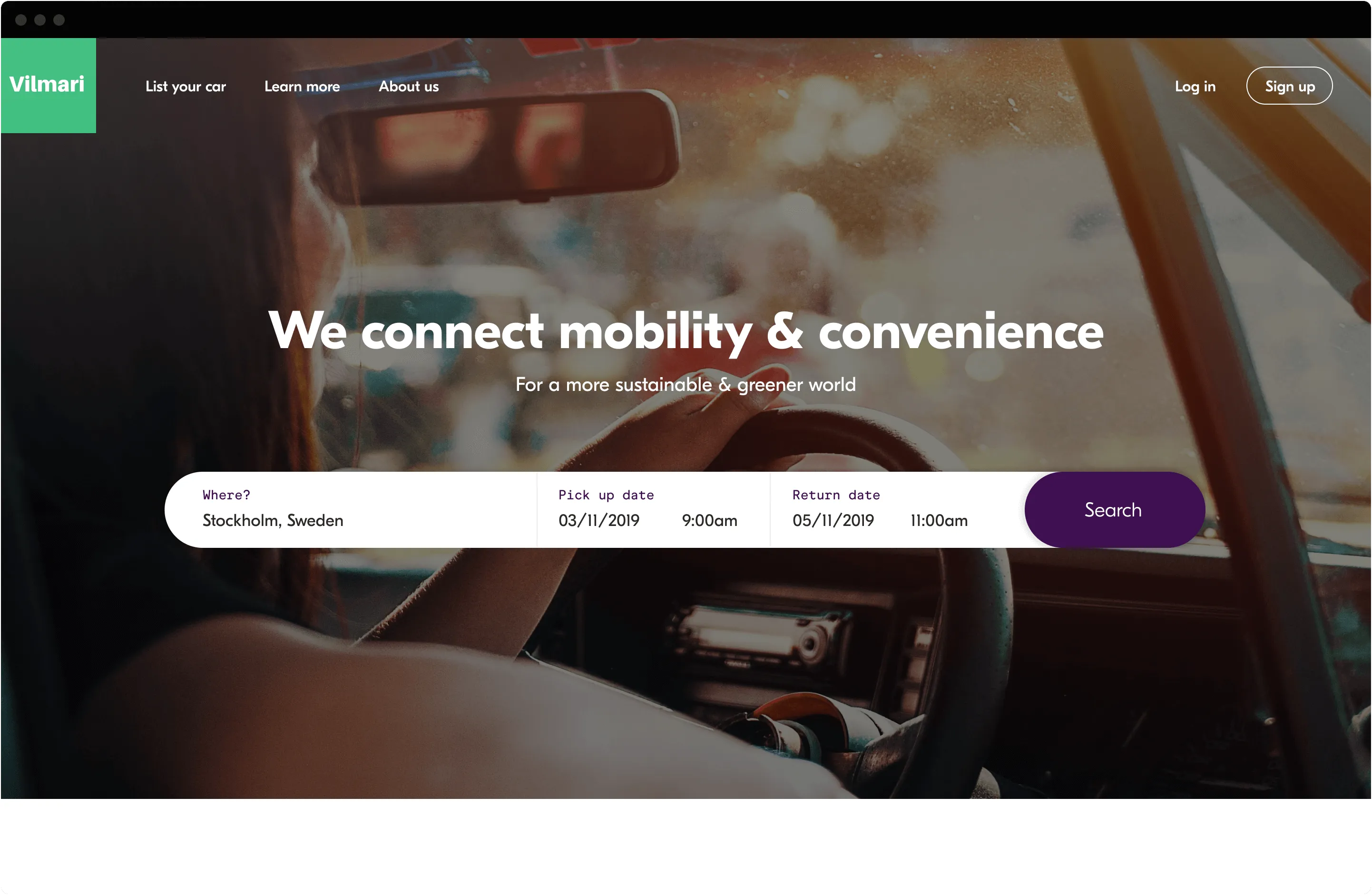


Homepage concepts we tested for trust and ease of search.
Setting the details
The final design focused on three areas:
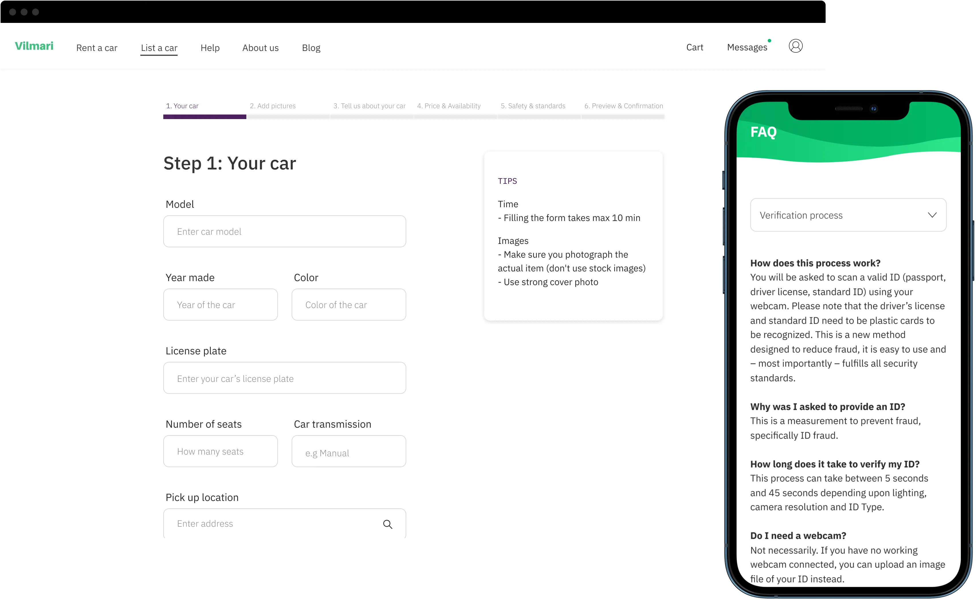
1. Verification you can trust. Every account goes through a careful check, including phone number and driver's license status. Both sides of a rental can see who they are dealing with, so nobody hands over their keys to a stranger.

2. A helping hand when listing a car. Adding a car for the first time raises a lot of questions. Tips and FAQs sit right next to the form, so owners get answers at the moment they need them.

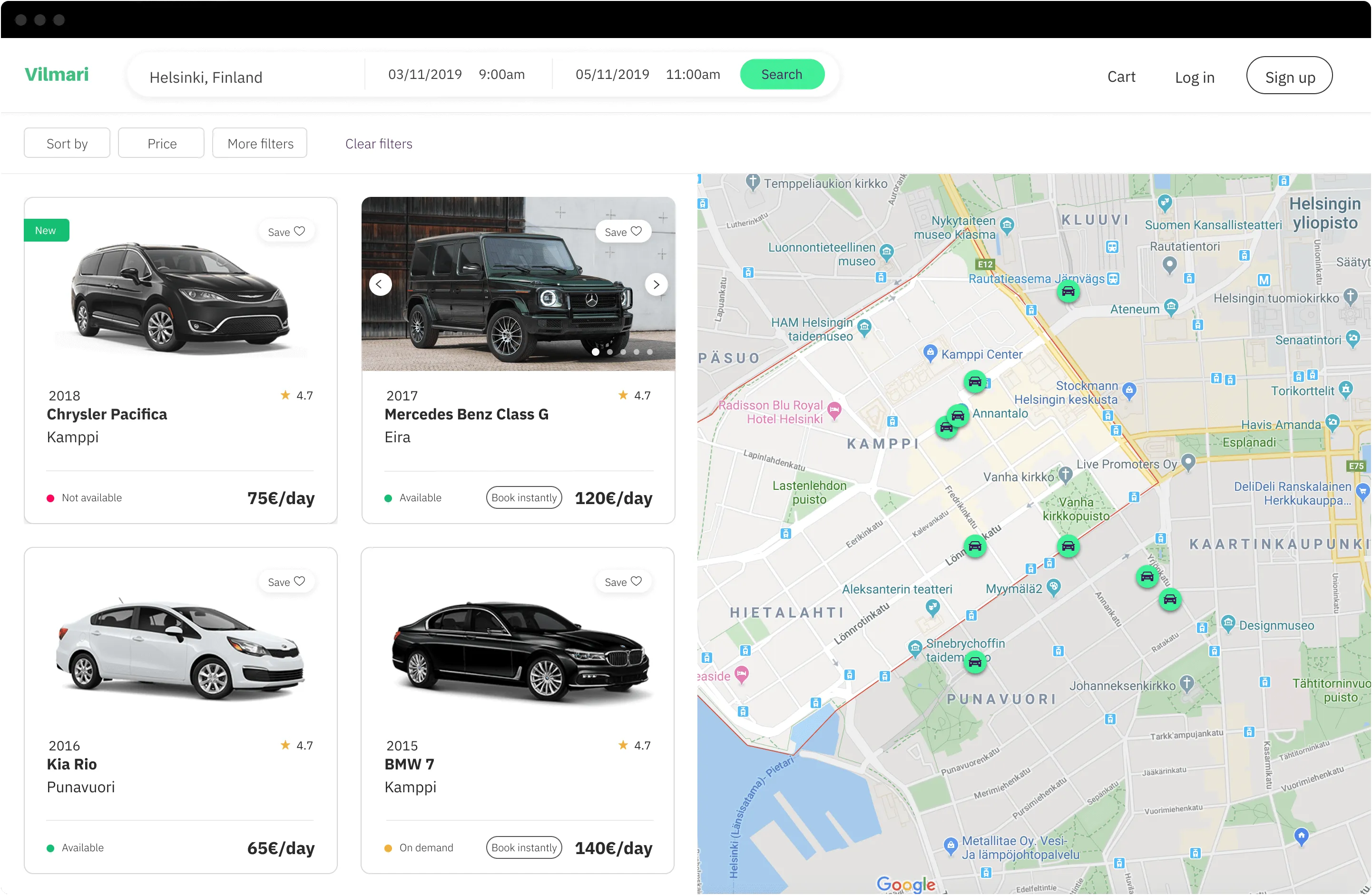
3. Search by map and availability. Many rentals are urgent. Map search and a clear availability status help people find a car close by and see right away whether they can book it.

The outcome
By the end of the project:
The brand, the web app and the core flows for renting and listing a car were designed end to end
The key ideas had been tested with real customers, and their feedback shaped the final design
The designs were ready for the team to build
What I learned
When strangers share something as valuable as a car, trust comes first. Verification, clear availability and help at the right moment did more for that than any visual polish. I now look for the moments where people hesitate, and design for those first.